Pattern Is Back: A Designer's Guide to Flamestitch, Fringe and Using Print with Confidence in 2026

Pattern is back, and this time it is not asking permission.
If you walked the showrooms at Focus/26 in Chelsea Harbour last week, or followed the coverage of the autumn launches, one thing was impossible to miss. After five years in which the fashionable British room was plain linen, plain wool and a single neutral wall, the fabric houses have returned to print with real conviction. Flamestitch, a seventeenth-century zigzag, is suddenly everywhere. Fringe is on sofas. Metallic threads are woven into damasks.
Fruit, feathers and botanicals are running across the new collections from Romo, GP & J Baker and Colefax & Fowler.

The press has already given it a name. Homes & Gardens called it print-maxxing in August: layering contrasting patterns within the same colour family so a room looks collected rather than coordinated.
I have been steering clients towards pattern for a couple of years now, usually against some initial resistance, so I am glad the market has caught up. But pattern is also the easiest thing in decorating to get wrong, and a great many rooms are about to prove it.
Here is what the return of pattern actually means, why it is happening now, and how to use it in a real British home without ending up in a room that shouts.
What is print-maxxing, and how is it different from maximalism?
Maximalism, the 2019 version, was about more. More colour, more objects, more contrast, a gallery wall on every surface. It was exhausting to live in and most people who tried it repainted within three years.
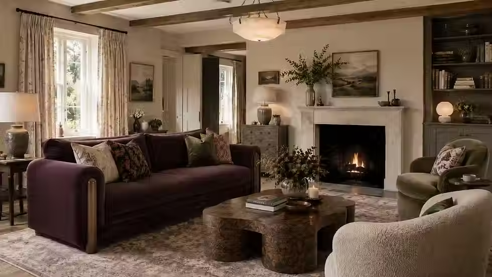
Print-maxxing is about depth rather than volume. The designer Laura Stephens described it in Homes & Gardens as "a striped sofa with a checked chair, an ikat curtain against ticking stripes", and the important part of that sentence is what it leaves out: nothing in it clashes in colour. The patterns differ in scale and type, but they share a palette. The eye reads the room as one warm, layered whole rather than a series of competing statements.
This is a very old English idea. The country houses that Modern English Country draws on have always mixed a chintz with a stripe with a Turkish rug, because those rooms were assembled over generations and nobody had the option of a matching set. What is new is the confidence to do it deliberately, and the fact that the fabric houses are now designing collections to be layered rather than chosen one at a time.
It also fits precisely with the shift from quiet luxury to found luxury that has defined this year. Quiet luxury needed pattern to be absent, because pattern carries personality, and personality was the enemy. Found luxury wants the room to look like it belongs to someone. Pattern is the fastest way to achieve that.
The four patterns of autumn 2026
Homes & Gardens' review of Focus/26 on 18 September picked out five defining trends, and four of them are about pattern and texture. Here is what each one is, and where it belongs.
Flamestitch
The zigzagging, multicoloured motif you will recognise from Italian bargello embroidery and from every serious country house library chair. Colefax & Fowler's Kemerton collection leads the revival, Casamance has a version coming for spring, and Neil Sherring is putting it on lampshades. Its great virtue is that it can read as traditional, folkloric or modern depending entirely on palette and scale. In plum, ochre and moss it is Modern English Country. In ivory and charcoal it is a Milanese apartment.
Where it belongs: a single armchair, a pair of cushions, a lampshade, an ottoman. Flamestitch on curtains is a commitment; flamestitch on a chair is a delight.
Softened metallics
Not the mirrored glamour of a 2015 hotel bar. Dedar's Croquis has a crocheted texture shot with metallic thread, and Zimmer + Rohde's Ardecora collection is full of glimmering moirés and damasks. The point is candlelight rather than disco: soft golds, silvers and bronzes with a time-worn quality that catch the light quietly.
Where it belongs: a blind or a headboard in a bedroom, a pair of curtains in a dining room lit mainly by candles and lamps, the back of a cabinet. Never on a sofa that a dog sits on.
Textured fabrics
Schumacher's Groove pairs a fuzzy fringe with embroidered stripes; Casamance showed a bobbled textile with a folky motif. This is pattern you feel before you see. It gives a tonal room the contrast it needs without adding a single new colour, which makes it the safest way in for anyone nervous about print.
Where it belongs: cushions, throws, an upholstered stool, the front of a footstool. Anywhere hands land.
Romantic, playful botanicals
Romo's Averly collection has a fruit motif and a feathered stripe. George & Minnie by GP & J Baker takes archival designs and recolours them in pink, orange, yellow and green. These are the hero prints, the ones that carry a room, and the collections are explicitly designed to mix with each other.
Where it belongs: curtains, a hero blind, a headboard, one wall of a bedroom or a downstairs loo. One per room.
The old pattern rules versus the 2026 rules
Most people learned a set of rules about pattern from magazines in the 2000s, and most of those rules are now wrong.
The old rule | The 2026 rule |
One pattern per room, everything else plain | Three or four patterns per room, one colour family |
Pattern on the small things, plain on the big things | Pattern on the big things too: curtains, a sofa, a wall |
Match the cushions to the curtains | Never match; relate |
Keep the walls neutral if the fabrics are patterned | Colour-drench the walls in a shade pulled from the print |
Metallics are for Christmas | Metallic thread is a texture, used year round |
Florals are old-fashioned | Florals are the hero print of the year |
Buy everything from one collection so it goes | Mix collections, mix decades, mix a new print with an old kilim |
The thread running through the new column is that pattern is no longer a decoration added at the end. It is the structure of the room, decided at the same time as the paint.
Six principles for layering pattern without it going wrong
Choose the hero print first, and choose it for the biggest surface. Every layered room has one pattern the others answer to, and it should go on the curtains, the sofa or a wall, not a cushion. A botanical from GP & J Baker or Romo at the window sets the palette for everything else. If you start with the cushions you will never find curtains to suit them.
Pull every other colour from the hero. The wall colour, the secondary fabrics, the rug and the lampshades should all be found somewhere inside the hero print. This is the single discipline that separates print-maxxing from a mess. A plum from the flowers on the walls, an ochre from the leaves on a chair, a stone from the background on the woodwork.
Vary the scale, not the palette. Large botanical, medium flamestitch, small stripe or check, tiny geometric on a lampshade. Four patterns at four scales in one colour family always work. Four patterns at the same scale never do, whatever the colours.
Add texture before you add another print. If a room feels thin, the answer is usually a bobbled cushion, a fringed throw, a mohair or a metallic-thread damask, not a fifth pattern. Texture gives contrast without adding visual noise, and it is where the Focus/26 collections are strongest.
Give the eye somewhere to rest. Every patterned room needs a few plain, generous surfaces: a plain linen sofa, a wide expanse of colour-drenched wall, a large plain rug. Around 60 per cent plain to 40 per cent pattern is the balance I aim for in a sitting room; a bedroom can carry more.
Let one thing be old. A worn kilim, a faded chintz on an inherited chair, a piece of antique suzani framed as a picture. Pattern with provenance is what stops a newly decorated room from looking newly decorated. In the 1stDibs 2026 Designer Trends Survey, 36 per cent of pieces designers sourced were vintage or antique, and textiles are the easiest and cheapest place to start.
How to do it on a normal budget
The fabric houses showing at Chelsea Harbour sell to the trade at prices that make a pair of curtains a serious investment. That does not mean pattern is only for the well-funded. It means you have to be strategic about where the expensive metre goes.
Spend the money on one hero.
A single blind, a headboard or one armchair in a serious print costs a few metres, not twenty. That one piece will carry the room, and everything around it can be modest.
Buy remnants and ends of rolls.
The trade showrooms, the fabric houses' own outlets and the better online remnant sellers are full of two- and three-metre lengths of exactly the collections that were on show last week. Two metres is a pair of cushions, a lampshade and a stool.
Frame textiles.
A metre of an extraordinary print, or an antique fragment of suzani or kantha, stretched over a frame is a piece of art for a fraction of the cost of a painting, and it brings pattern to a wall without wallpaper.
Use the high street for the plain layers.
The 60 per cent of the room that should be plain does not need to come from Chelsea Harbour. John Lewis's autumn collection, for instance, leans heavily on plain natural linens, walnut and oak, and an embroidered pomegranate lampshade at £45 is a perfectly good small-scale pattern to sit beneath a grander print.
Re-cover rather than buy.
An old chair with good bones, re-upholstered in a flamestitch, will outlast anything new and cost less than most new chairs. This is where the vintage instinct and the pattern instinct meet.
Frequently asked questions
Can I mix pattern in a small room?
Yes, and small rooms often take it better than large ones because the patterns are close enough to read as one scheme. Keep the scale of the hero print down, colour-drench the walls in a shade from it, and use texture for the secondary layers.
Does pattern date faster than plain?
Badly chosen pattern dates instantly. Well chosen pattern, particularly archival designs like flamestitch, ticking and a good chintz, has been in British houses for two hundred years and will be in them for two hundred more. Buy the pattern with a history, not the one from the trend piece.
Will patterned curtains make my room look smaller?
Only if the print is dark and the walls are pale, which creates a hard edge. Match the wall colour to the ground of the print and the curtains dissolve into the room rather than boxing it in.
Is flamestitch a fad?
It is a seventeenth-century Italian technique that has never fully left the English country house. Its current visibility is a revival, not an invention, and a single flamestitch chair will still look right long after the trend pieces have moved on.
Where should I start if I am nervous?
A pair of cushions in a textured or bobbled fabric and one lampshade in a small-scale print, both in colours already in the room. Live with them for a month. Then buy the chair.
Are you thinking about bringing pattern into your home?
The fabric houses have made their move and the collections that launched this month are the most confident I have seen in years. The skill is not in finding a beautiful print, there are hundreds, but in choosing the one hero, building the palette from it and knowing when to stop. That's the part I do.
If you are planning a redecoration in Hampshire, Berkshire or Surrey and want a room that uses pattern with confidence rather than caution, I would love to talk. And if you want the full picture on 2026, I have written a 26-page guide covering the warm earthy palette, the dining room's return, the broken-plan reversal and the looks I am gently steering clients away from. You can find out more here.
Gemma Budworth is the founder of Gemma Budworth Interiors, a British interior design studio specialising in modern heritage homes, based in Sherborne St John near Basingstoke, Hampshire.
Sources
5 defining interior trends from Focus/26, Homes & Gardens, 18 September 2026
The 7 biggest fall trends for 2026, Homes & Gardens, 25 August 2026
Focus/26: what's on and where to see, ELLE Decoration, September 2026
I was given an early look at John Lewis' autumn homeware collection, Ideal Home, 17 August 2026