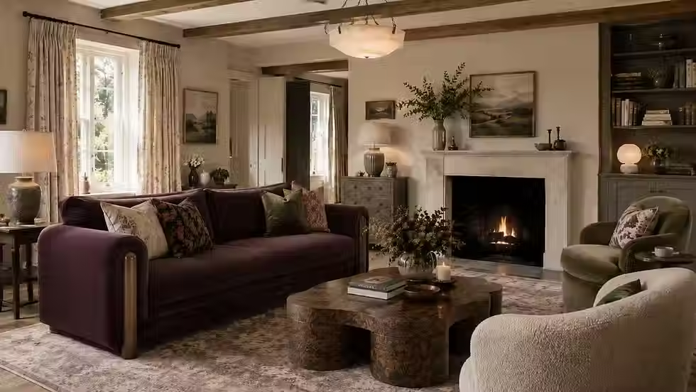
Soulful Sage: A Designer's Guide to Dulux's Colour of the Year 2027

Dulux has named its Colour of the Year for 2027, and it is a sage green.
Soulful Sage, announced on 8 September, is a soft, silvery grey-green that Dulux describes as calm, uplifting and "taking us straight back to nature". It replaces Rhythm of Blues, the 2026 pick, and it arrives at a moment when the British design conversation has been moving decisively towards warmth, plum, terracotta and the layered, collected rooms I have been calling found luxury.

So my first reaction, and I suspect the reaction of quite a few designers, was a raised eyebrow. Sage green had its moment. It was the colour of every 2021 kitchen island and every new-build bedroom. Was it not on its way out?
The short answer is that this is not that sage. And the longer answer is that a Colour of the Year is never really a colour. It is a forecast about how people want to feel in their homes, and on that score Dulux has read the room correctly.
Here is what Soulful Sage actually is, why it has been chosen now, where it works in a real British house, and where I would gently steer you away from it.
What is Soulful Sage, and why did Dulux choose it?
Soulful Sage is a muted, grey-leaning green with a distinctly silvery cast. It is lighter and cooler than the olive and eucalyptus sages of five years ago, closer in spirit to the green of lichen on a stone wall than to a new leaf. In a north-facing room it reads almost as a warm grey. In a south-facing room it comes alive as a proper, gentle green.
The choice comes out of AkzoNobel's annual ColourFutures research, which brings together trend forecasters and designers to identify the mood of the year ahead. Their reading for 2027 is that people are exhausted by information overload and by a general sense of global uncertainty, and that they want their homes to feel lighter and more considered as a result. Green, and specifically a soft green with clear connections to nature, is the colour they landed on as the answer.
Marianne Shillingford, Dulux's Creative Director, put it this way: "Our homes should provide a counterbalance, somewhere we can switch off, reconnect, and make room for moments of joy."
What I find more useful than the headline colour is the three supporting palettes Dulux has built around it, because they show how flexible the shade is meant to be:
Glow pairs Soulful Sage with warm earth tones: clay, terracotta and stone, with a lift of lilac. This is the palette closest to what I am specifying for clients right now.
Light sits it among airy, understated neutrals: soft browns, greys and blues. Quiet, restorative, and the most conventional of the three.
Lift is the bold one, with yellowy ochres and soft pinks. Joyful, and a genuine surprise from a brand that sells a great deal of white paint.
As Shillingford says, the point is that the same green "can feel warm and nurturing alongside earthy tones, peaceful and restorative with quieter shades, or fresh and energising with more joyful colours". That adaptability is the whole argument for it.
Is sage green really still relevant in 2026?
Yes, but not in the way it was relevant in 2021, and the difference matters.
The sage of the early 2020s was a safe choice. It was the green you picked when you wanted colour without commitment, and it was applied in exactly the same way in thousands of homes: shaker kitchen, brass handles, white worktop, done. That version of sage is tired because the formula is tired, not because the colour is.
What has changed since is the appetite for green generally, and for deeper, moodier versions of it. Houzz's June report on emerging UK home trends found searches for forest green up 115 per cent year on year, moody living rooms up 135 per cent and dark ceilings up 126 per cent. In its 2026 UK Kitchen Trends Study, green was the second most popular cabinet colour at 17 per cent, a whisker behind blue at 18 per cent and well ahead of grey, off-white and white. Green has become a serious, grown-up colour in British homes, and Soulful Sage is the light, breathable end of that spectrum rather than a return to the 2021 version.
The other thing that has changed is the company it keeps. Five years ago sage lived with white and pale oak. Today, the found-luxury palette I have written about elsewhere on this blog gives it walnut, plaster pink, terracotta, aubergine and warm creamy whites to sit against, and it looks like an entirely different colour in that context. Paired with a Belgian chocolate brown and unlacquered brass it is elegant. Paired with a grey sofa and a white ceiling it is a dentist's waiting room.
It is also worth noting that Dulux is not alone. Little Greene added 26 new colours to its Colours of England and Colour Scales ranges on 14 September, and the direction of travel across the premium British paint houses this autumn is towards complex, historical greens, browns and blues rather than the flat greys of the last decade. Soulful Sage is the mass-market expression of a shift the specialist brands have been leading for two or three years.
Where Soulful Sage works, and where it doesn't
Because it is a grey-green, Soulful Sage is unusually sensitive to light. The same tin will give you two different rooms depending on which way the windows face. Before you commit, paint a large sample board and move it around the room over a full day.
Situation | Verdict | Why |
South- or west-facing sitting room | Excellent | Warm afternoon light brings out the green and softens the grey |
North-facing room with white ceiling and grey furniture | Avoid | Reads as cold institutional grey; the colour disappears |
Kitchen cabinetry with warm stone or timber worktops | Excellent | Green cabinets are now 17% of UK kitchens, and this shade sits well with oak, walnut and honed limestone |
Colour-drenched snug, study or downstairs loo | Very good | Walls, woodwork and ceiling in one shade removes the grey-on-white contrast that makes it feel flat |
Bedroom, paired with warm whites and linen | Good | Restful without being bland; keep the ceiling off-white rather than brilliant white |
Period hallway with original woodwork | Good, with care | Beautiful on panelling or dado below a warmer plaster tone; less successful across every surface |
New-build with grey composite windows and grey floor | Avoid | Too much grey; you need warmth somewhere to make the green legible |
Exterior front door or garden joinery | Very good | Reads as a soft heritage green outdoors and weathers gracefully |
The pattern is simple. Soulful Sage needs warmth nearby, either from the light, from timber and brass, or from the colours you put beside it. Give it that and it is one of the most versatile shades Dulux has produced. Deny it and you will spend a year wondering why your room feels like an office.
Five ways I would actually use it in a British home
1. Drench a small room in it. The single best use of a mid-toned green is to paint everything: walls, skirting, architrave, door, ceiling. In a snug, a study or a downstairs cloakroom the effect is enveloping rather than gloomy, and it solves the problem that plagues sage in most homes, which is a white ceiling making the walls look dirty by comparison. Houzz's data shows searches for cosy snugs up 161 per cent this year. This is the colour for one.
2. Put it on the kitchen cabinets, not the walls. Green cabinetry has overtaken grey and is running neck and neck with blue. Soulful Sage on a painted-timber kitchen with a warm stone worktop, aged brass or bronze hardware and an off-white wall is a scheme that will still look right in ten years. Resist the urge to also paint the walls green. One green surface, plenty of warmth around it.
3. Use it as the quiet partner to a hero colour. In a found-luxury room the colour that carries the scheme is often a plum, a rust or a deep brown. Soulful Sage is a wonderful supporting shade for these: on the woodwork beneath a terracotta wall, on a bookcase behind a walnut desk, on the inside of a cupboard that opens onto an aubergine hall. It calms the stronger colour without diluting it.
4. Take it outside. Front doors, garden gates, a greenhouse, the frame of a garden room. Grey-greens have been the choice of the National Trust for generations for good reason. They sit naturally against brick, flint and stone, and they weather into the landscape rather than fighting it.
5. Try it on a ceiling. Statement ceilings are one of the stronger trends of the year, with wallpapered ceilings up 88 per cent in Houzz searches. A soft green ceiling over warm plaster-pink or stone walls is a gentle, unexpected version that suits a bedroom or a dining room beautifully, and it costs very little more than painting the ceiling white.
What I would not do is buy the Colour of the Year because it is the Colour of the Year. Paint it because your room faces the right way, because you already own the walnut sideboard and the rust velvet chair it will sit beside, and because you want a home that feels calmer. If the honest answer is that you wanted a warm brown all along, buy the warm brown.
What to pair it with
Dulux's own pairings are a sensible starting point. In the Glow palette it sits with Belgian Chocolate, Clay Walls, Cinnamon Sprinkle and Violet Storm. In Light it goes with Double Espresso, Nordic Waters, Earl Blue and Arctic Pebble. In Lift, with Taupe Pink, Hemp Cloth, Honey Bear and Smokewood Taupe. Of the three, Glow is the one that aligns most closely with where British interiors are heading, and Light is the one most people will actually buy.
Beyond paint, the materials matter more than the exact shades:
Timber: walnut, dark oak and stained ash rather than pale Scandi oak. The warmth of the wood is what makes the green feel intentional.
Metal: aged brass, bronze and unlacquered brass. Brushed nickel, the most popular kitchen hardware finish in the UK this year at 19 per cent, is fine but will pull the scheme cooler.
Stone: honed limestone, travertine, a warm-veined marble. Avoid grey quartz.
Textiles: rust or terracotta velvet, undyed linen, a hero floral or paisley with plum or ochre in it, an old kilim underfoot.
Walls beside it: a warm off-white with a yellow or pink base, a plaster pink, a soft ochre. Not brilliant white, and not a cool grey.
The test I use is whether the room would look good by candlelight. Soulful Sage with walnut, brass and a rust chair glows in the evening. Soulful Sage with chrome, grey and white simply goes dark.
Frequently asked questions
Is Soulful Sage warm or cool? Cool-leaning. It has a grey and silver base rather than a yellow one, which is why it needs warm materials and warm neighbouring colours to come alive. In strong afternoon sun it warms up considerably.
Will it date quickly? Less quickly than the olive sages of 2021, because it is more muted and more historical in feel. Soft grey-greens have been in British houses since the Georgians. The risk is not the colour dating but the formula around it dating, so avoid the shaker-and-brass template everyone already has.
Can I get the same shade from Farrow & Ball or Little Greene? Not identical, but there are close relatives across all the premium British brands, and Little Greene's 26 new colours launched this month include several complex greens worth sampling alongside it. If you are already using a premium paint elsewhere in the house, match within that range rather than mixing brands on adjoining surfaces.
Is it a good colour for selling a house? It is safer than most greens and reads as calm and cared-for in photographs. Keep it to one or two rooms rather than the whole house if resale is the priority.
Does it work in a modern extension? Yes, particularly on the kitchen cabinets or a run of joinery, against a warm floor and plenty of daylight. In a glass-box extension with a grey floor it will look grey.
Thinking about a green room?
A Colour of the Year is a useful prompt and a poor instruction. Soulful Sage is a good colour that will make a great many rooms feel calmer, and a smaller number of rooms feel like a waiting room. The difference is almost entirely about light, materials and what you put beside it, which is exactly the part a designer can help with.
If you are planning a repaint or a bigger project in Hampshire, Berkshire or Surrey and want a scheme that uses colour with confidence rather than following the tin, I would love to talk. And if you want the full picture on where British interiors are heading, I have written a 26-page guide covering the warm earthy palette, the return of the dining room and the looks I am gently steering clients away from. You can find out more here.
Gemma Budworth is the founder of Gemma Budworth Interiors, a British interior design studio specialising in modern heritage homes, based in Sherborne St John near Basingstoke, Hampshire.
Sources
Dulux reveals Soulful Sage as Colour of the Year 2027, Dezeen, 8 September 2026
Dulux Colour of the Year 2027: Soulful Sage, Homes & Gardens, September 2026
Houzz reveals 10 emerging UK home design trends for 2026, Insight DIY, 9 June 2026
2026 UK Houzz Kitchen Trends Study, Insight DIY, 2026
Little Greene new colours 2026: launching 14 September, Relics of Witney, September 2026