Little Greene's 26 New Colours: A Designer's Guide to the Turned-Down Palette

Paint is getting quieter, and Little Greene has just said so out loud.
On 14 September 2026 the Manchester paint house released 26 new colours across its Colours of England and Colour Scales collections, and brought back one archived shade, Putti. It is a substantial rewrite of the colour card, not a seasonal top-up.
What matters is not the number. It is the brief. Ruth Mottershead, Little Greene's creative director, described the new shades to Ideal Home as "mid-tones, balanced, gentler colours that still have character, but with the saturation turned down. These are colours that are easy to live with."

That sentence describes almost every scheme I have signed off this year. Clients arrive with a Pinterest board of drenched plum dining rooms and butter yellow kitchens, and after a month of living with sample boards they land somewhere softer, warmer and far more forgiving of a grey November afternoon.
The turned-down palette is the story of autumn 2026. Here is what it actually means, why it is happening now, and how to use it in a real British home.
What is the turned-down palette?
It is colour with the volume set to seven rather than eleven. Not beige, not grey, and certainly not the drenched jewel tones of 2024. Think of a blue that reads as green in the evening, a pink that behaves like a warm white, a brown that cocoons a room without swallowing it.
Little Greene's launch is the clearest expression of it. Five colours join the Colours of England range: Haye White, a warm white made with ochre that Mottershead calls "a true everywhere white"; Perpetual Blue, a mid to deep blue with a hint of green, taken from a surviving palette Sir Winston Churchill used in his studio at Chartwell; Parlour, a pale plaster pink from the north-facing "Slop't Parlour" at Dyrham Park near Bath; Floss, a pink at roughly half the intensity of Carmine; and Ashes of Marigold, the bold 1970s Marigold with black added to take the edge off.
The other 21 sit in Colour Scales, now organised into 18 graduated families with a root colour and lighter and darker steps. Barge Stone is a cooler evolution of Portland Stone that reads green despite containing no green pigment. Marle is a mid brown built from yellow ochre, black and red oxide. Hillside is a warmer sage found on plaster in the library at Hughenden Manor. Rome is a deep green-leaning blue from a guest bedroom at Mount Stewart. Elysian Yellow, from the Chinese House at Stowe, is a yellow that does not obviously look yellow.
Read those descriptions again and a pattern appears. Nearly every colour is a known shade with something taken away: less saturation, less umber, less lime. Mottershead herself put it plainly to Homes & Gardens: "Colour trends are always an evolution rather than a revolution."
Why is this happening now?
Three things have converged:
First, the loud colours have peaked. On 3 September, Livingetc reported designers falling out of love with butter yellow, denim blue, maximalist pink, off-white and sage green, and replacing them with ochre and caramel, neutralised blues, dusty rosewood, mushroom neutrals and a lighter mint. Every one of those replacements is a turned-down version of the thing it replaces. A month earlier, on 3 August, the same title listed beige-drenched palettes, too many curves and overly reflective surfaces among the trends designers expect to date fastest.
Second, the paint houses have been building towards tonal schemes for a while. Farrow & Ball's colour curator Joa Studholme told Woman & Home in June that, "hot on the heels of the fantastically popular colour drenching trend, we're now embracing whole colour families using a tonal wash to cover all elements of the room." Little Greene's graduated Colour Scales families are the same idea turned into a product: pale on the ceiling, root colour on the walls, deeper step on the woodwork.
Third, and this is the part I care most about, it fits how British homes are being decorated in 2026. Modern English Country has become the dominant aesthetic, and it does not want a shouting wall. It wants a background that lets a vintage walnut chest, a hero floral on one armchair and a well-chosen suzani do the talking. Found luxury, the successor to quiet luxury, is about provenance and imperfection, and mid-tone historic colours with a National Trust back story are the natural setting for it.
How does the new palette compare with the old one?
What we were specifying in 2024 to 2025 | What the turned-down palette offers instead | Why it works better in a British home |
Drenched plum or aubergine dining room | Marle or Perpetual Blue on walls with a paler step on the ceiling | Keeps the cocoon, loses the bruise-coloured effect under LED downlights |
Butter yellow kitchen | Elysian Yellow or Farrow & Ball Duster | Warmth without the nursery feel; sits happily with oak and unlacquered brass |
Bright sage or mint hallway | Hillside or Boxington | Warmer, so it does not go icy in a north-facing entrance |
Crisp off-white throughout | Haye White or Parlour | Ochre or plaster undertone flatters limewash, linen and old timber |
Full-strength terracotta accent | Ashes of Marigold | Reads as terracotta in daylight, quietens to earth by candlelight |
Cool Portland Stone or greige | Barge Stone family | Pairs with honed limestone and slate floors instead of fighting them |
How to use the turned-down palette in a real home
Choose the root colour first, then climb the scale. Little Greene's families are built to be used vertically. Pick the mid-tone you can imagine living with for ten years, put it on the walls, take one step lighter for the ceiling and one step darker for skirting, architraves and any panelling. You get depth without a single contrasting colour, which is exactly what makes a period cottage or a 1930s semi feel considered rather than decorated.
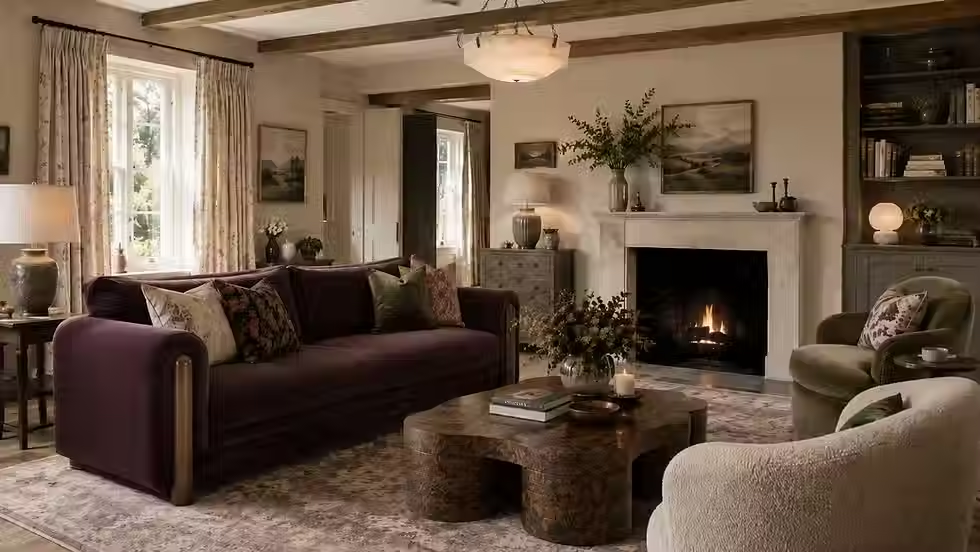
Let the wall be the supporting act. One hero piece per room is a rule I hold to, and these colours exist to serve it. A Parlour or Haye White living room is the frame for a walnut sideboard, a plaster pink is the frame for an inky velvet sofa. If you cannot name the hero, the colour will look unfinished, because it is doing the job of a background with nothing in front of it.
Sample on the right wall at the wrong time of day. Perpetual Blue and Celestial Blue are sold on the way they change with light, and that cuts both ways. Paint two A4 boards, tape one on the north wall and one opposite the window, and look at them at 7am and 9pm with the lamps on. Hampshire light in October is not Chartwell light in June.
Warm the greys, do not banish them. Oilcloth and Cobble are grey with a green base, and they are the right answer for anyone who loved the grey decade but knows it has gone cold. Put them next to raw linen, aged oak and a honed limestone hearth and they read as stone, not as an office.
Use the historic pinks as neutrals. Flight Pink, from the great staircase at Wimpole Hall, and Parlour are quieter than the plaster pinks of 2023. Treat them as warm off-whites for halls and landings, and save Floss for a downstairs loo or a boot room where a bit of play is welcome.
Anchor with brown, sparingly. Marle is the colour I expect to see most in Modern English Country schemes this winter. Use it in a snug, a study or a dining room that is used after dark, keep the ceiling in its paler step, and light it properly with low-level lamps and a picture light rather than a central pendant. Brown drenched under a single downlight is how the beige backlash started.
Mix the decades in the furniture, not the paint. The palette is deliberately calm so that the room can hold a Georgian chest, a 1970s rattan chair and a contemporary linen sofa without arguing. Resist the urge to add a fourth colour. Add a suzani, a kilim or a hero floral instead and let pattern do the work colour used to.
Where would I gently steer clients away?
I would steer clients away from painting an entire house in one family. A tonal scheme is lovely in a room; across seven rooms it becomes a show home. Give the dining room Perpetual Blue, the snug Marle, the bedrooms Parlour or Hammock, and let the hallway in Haye White tie them together.
I would also steer clients away from treating this launch as a licence to be timid. Turned down is not turned off. Rome, Perpetual Blue and Ashes of Marigold are still proper colours with weight, and a home decorated entirely in the palest steps of each family will look like it is waiting for something to happen.
And I would gently push back on anyone specifying Hillside simply because it is "the new sage". It is warmer and better, but the reason sage dated is not the pigment. It is that it was put everywhere at once.
FAQ
Are Little Greene's new colours available now?
Yes. The refreshed colour card launched on 14 September 2026 and free colour cards and sample pots can be ordered from Little Greene directly. If you are visiting a local stockist, ring ahead to check they have the new card in.
Which of the new colours is the safest choice for a north-facing room?
Haye White. The ochre in it lifts a cold room without tipping into cream, and it works on walls, ceilings and woodwork together, which is why Little Greene describes it as an everywhere white. Parlour is the next step if you want a little more warmth.
Is the turned-down palette just beige by another name?
No. Beige is an absence of undertone. Barge Stone reads green, Marle reads red, Elysian Yellow reads gold, and that undertone is what makes them shift with the light and sit well with natural materials. Beige-drenched rooms are on the list of trends designers expect to date quickly precisely because they have none of that.
How does this fit with Dulux's Soulful Sage for 2027?
Comfortably. Soulful Sage is a mid-tone, low-saturation green, which is the same instinct at a different price point. If you are planning a scheme now, Hillside and Boxington give you the historic, warmer version of that green.
Will these colours date?
The Colours of England shades are drawn from surviving paint at Chartwell, Dyrham Park, Wimpole Hall, Hughenden and Mount Stewart. Colours that have already lasted two centuries in a National Trust house are as safe a bet as paint gets. What dates is overuse, not the shade.
Thinking about repainting this autumn?
If you are planning a redecoration or a full renovation in Hampshire, Berkshire or Surrey and want a palette that will still feel right in 2036, I would love to talk it through. The studio works from Sherborne St John and takes on projects across Basingstoke, Winchester, Newbury, Farnham and the surrounding villages.
If you want the full picture on 2026, I have written a 26-page guide covering the warm earthy palette, the dining room's return, the broken-plan reversal and the looks I am gently steering clients away from, you can find out more here: https://www.gemmabudworthinteriors.co.uk/post/it-s-2026-quiet-luxury-is-over-i-ve-written-a-26-page-interior-design-ebook-on-what-s-replacing-it
Gemma Budworth is the founder of Gemma Budworth Interiors, a British interior design studio specialising in modern heritage homes, based in Sherborne St John near Basingstoke, Hampshire.
Sources
Introducing our refreshed colour card, Little Greene, 14 September 2026, https://www.littlegreene.com/blog/introducing-our-refreshed-colour-card
Little Greene just dropped 26 new paint colours that will transform any room into a cocooning retreat, Ideal Home, 14 September 2026, https://www.idealhome.co.uk/all-rooms/little-greene-26-new-paint-shades-2026-first-look
Little Greene Just Launched 27 New Heritage Paint Colors, Homes & Gardens, 14 September 2026, https://www.homesandgardens.com/decor/paint/little-greene-new-paint-colors
Little Greene Introduces 26 New Colors Across Two Updated Collections, The Nordroom, 14 September 2026, https://www.thenordroom.com/little-greene-26-new-colors/
Designers Have Already Fallen Out of Love With These 2026 Wall Color Trends, Livingetc, 3 September 2026, https://www.livingetc.com/advice/dated-wall-color-trends-2026
5 Trends That Are So Big Right Now Designers Are Convinced They'll Be Out of Style Very Soon, Livingetc, 3 August 2026, https://www.livingetc.com/ideas/interior-trends-already-going-out-of-style-in-2026
Forget colour drenching, Farrow & Ball are leading the charge with a new 'tonal' paint trend for 2026, Woman & Home, 7 June 2026, https://www.womanandhome.com/homes/homes-news/farrow-and-ball-gradient-layering-paint-trend-2026/